- This month in content
- Posts
- This month in content #3 – December 2024
This month in content #3 – December 2024
A roundup of content examples I came across this month, from Figma, Gong, Greenly, Google, and more.
Tabitha Whiting
December 27, 2024
The best content examples I've come across in December 2024:
Born in … PPM
Google’s Year in Search
Subverting viral LinkedIn post formats
The best and worst cold call openers – Gong Labs
Greenly’s Legislation Checker
Everything we shipped in 2024, by Figma
Notion’s product demo videos
Born in … PPM
This one is a bit of a cheat because it definitely isn’t from this month, but it’s a brilliant example of a creative and purposeful use of visual content that I wanted to give props to.
Photographer Mary-Lou Mauricio took a series of photos of people posing with the concentration of CO2 that was in the atmosphere at the year of their birth – in parts per million, or PPM.
The result is a campaign site that highlights how quickly global warming has accelerated in recent decades through the range of ages depicted – as you can see with the image below, juxtaposing an elderly lady born at 307 PPM, with a young girl born at 407 PPM.
Centring the site around portraits also brings human to the centre of climate change.
One big challenge in climate change communication is how to right the misconception driven by decades of media and advertising that climate change is just an environmental problem. Too many climate change campaigns focus on scientific facts and statistics that simply don’t cut through to the real human impacts that truly matter. But these photos perfectly combine those PPM statistics with the reason that they matter, the children who will face the worst impacts.
It’s simple but it’s profound.

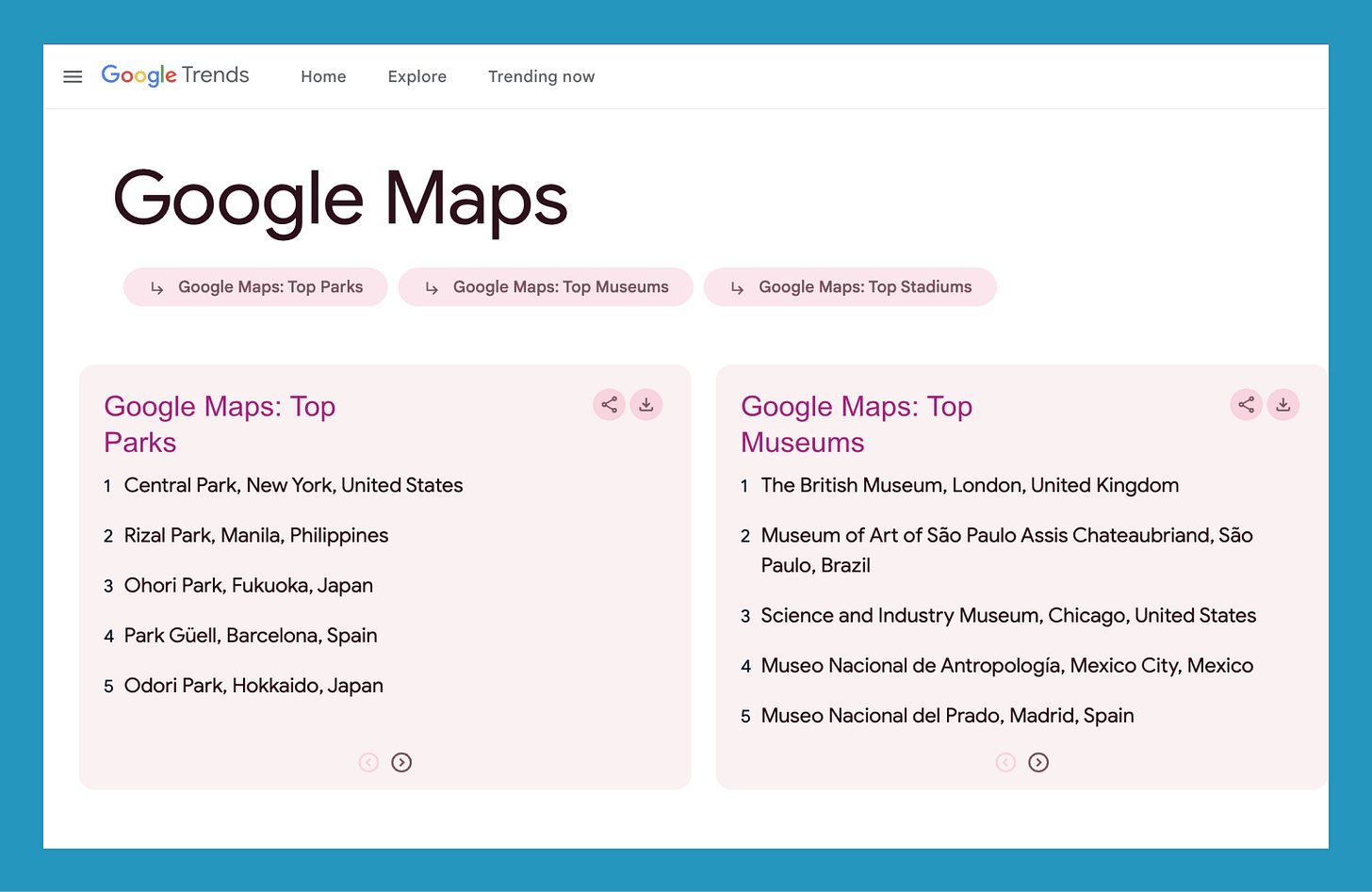
Google’s Year in Search
Each year Google released the top trending searches in categories like people, sports, news, songs, and more.
It’s actually pretty simple data – the top 5 searches in each of these categories is presumably pretty easy data for a massive data company like Google to gather – so it’s a good example to show that even a small amount of proprietary data about how users use your product can make for engaging content (see the section on Gong Labs for another idea in the same vein).
My personal favourite category from this year is Google Maps – the top searched parks and museums this year (and stadiums, but sport isn’t my jam.)
This month I’ve seen a fair few LinkedIn posts that take those viral formats that B2B influencers love to use to share their life-changing hacks and controversial takes, and turn them on their head.
And I love it.
A personal favourite has been Ken Cheng’s posts – like this one sharing his tip for building income with a financial hack.
Given the 40,000+ people who liked this post, I guess a lot of other people are also feeling the frustration of the bullshit that ‘influencers’ on LinkedIn like to share as fact.
There’s no real takeaway for content teams here, unless this kind of content fits your brand vibe or you’re one of those ‘influencers’, this one’s mostly just here for the pure entertainment value.

The best and worst cold call openers – Gong Labs
I recently came across Gong Labs. It’s a series of blogs by Gong, sharing insights gathered by analysing the millions of sales calls that happen through the Gong platform.
I’m a big fan of original research content, especially when it’s unique insights via a company’s proprietary data – whether that’s from an owned database or by analysing how customers use the product, which is what Gong are doing here.
There’s a lot to learn here for tech companies who have similar data on how their users interact with their product.
In this specific example, the Gong team analyse the 300 million cold calls that have taken place through Gong’s software to find out which opening lines have the best and worst outcomes.
Here’s a snapshot of the results for the top openers they analysed:
🥇 Have you heard our name tossed around?
🥈 Could I get 30 seconds to tell you why I called?
🥉How’s your day going?
❌ Did I catch you at a bad time?

Greenly’s Legislation Checker
Practical content that is actually useful for the target audience is a big win in my eyes – I love a tool, template, calculator, guide, etc.
Climate legislation is heating up, which leaves sustainability leaders with a lot of policies to stay on top of in terms of sustainability reporting, greenwashing regulations, emissions reductions requirements, and more.
It’s never easy to wade through legalise, accurately interpret the actions needed, explain that to other stakeholders, keep on top of legislation changes and developments, and actually implement the reporting or actions required.
So climate companies that can help with that, are onto a winner.
Greenly has clearly recognised this, creating a legislation checker tool that enables companies to submit their profile and see at a glance the steps they need to take.
It’s also a great SEO play as terms relating to sustainability legislation will only grow in traffic as new laws are implementing and reporting kicks off.

Everything we shipped in 2024, by Figma
Product velocity can be a major point of value for tech companies, the speed at which their product grows with new tools and features.
It’s an even bigger point of value if those new product features are built based on listening to customer feedback and building to meet their needs.
Figma has packaged this value perfectly in a wrap up blog which runs through all of the product developments implemented in 2024 – and how each of those relates directly to customer feedback and requests.
And, as you might expect from a design tool, it’s visually pleasing too.
It’s a bit late to borrow this idea for this year, but definitely one to bookmark for Q4 2025.

Notion’s product demo clips
This month I spotted Notion sharing a couple of super short video clips as LinkedIn posts, that highlight a specific use case of Notion that users might not be aware of – those tips, hacks, and shortcuts that make using a platform even more delightful.
This is a format that any tech company could replicate to highlight all the great features of their platform that have been designed to make life easier for users or solve specific pain points.

That’s it for this month, see you in January!
✨